A former professional boxer turned health and performance coach sought a website that embodies his core values of achieving high performance through expertise. The design needed to be professional and modern, instilling trust while clearly showcasing his firm and energetic approach to health, regeneration, and peak performance. A strong, structured layout with a bold aesthetic was essential for clarity, paired with a blue color palette for stability and an authoritative font to reflect his expertise. The final design needed to strike a balance between a dynamic, high-energy feel and a clean, professional look, positioning the client as a trusted expert in his field.
The Result
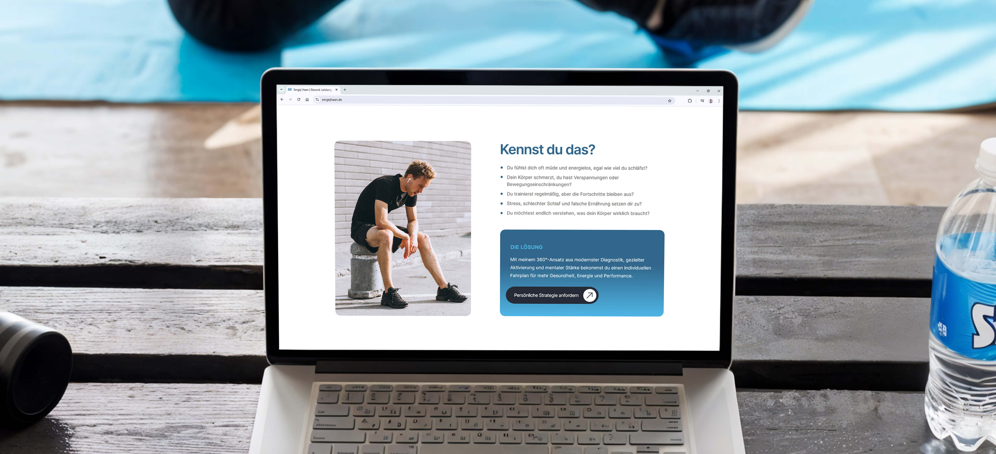
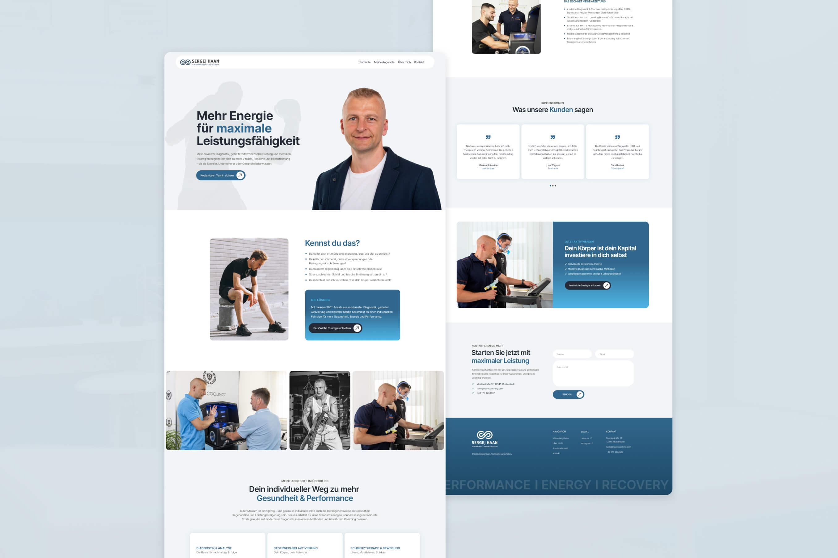
The final design is built around a refined blue color palette, reinforcing the themes of trust, expertise, and high performance. Steel blue is used strategically to highlight key sections and emphasize important keywords within headlines, while a tint of that steel blue is used to provide subtle tone to the background areas. Sky blue serves as an additional accent, injecting a sense of energy and vitality.
The layout is characterized by a balance of high-contrast sections and lighter areas, creating a rhythmic flow that keeps users engaged while ensuring clarity and readability. Smooth curves on boxes, images, and buttons introduce a sense of fluidity, making the overall design feel both modern and professional.
Authenticity is enhanced through the use of real photographs of the client, carefully color-matched to maintain cohesion with the site’s design. Additionally, framed minimalist icons visually support the diverse range of services, reinforcing clarity around the nature of each service.
For typography, Inter was chosen for its versatility, striking the perfect balance between professionalism and strength – precisely the impression the client wanted to convey.
The combination of design direction, colors, and shapes resulted in a website that radiates energy and strength, while maintaining a smooth, modern aesthetic that exudes professionalism and expertise.
Get in Touch
Let’s Build Your Online Presence!
Reach out today to discuss your website idea, and let’s bring it to life.